Staples.com Checkout Redesign
Context
As part of the project roadmap, there were a few enhancement requests that caused me to step back and rethink whether trying to shoehorn them into the existing design made sense or if the experience would be better served with a wholesale redesign. I convinced the stakeholders that a redesign would be worth the effort.
- Streamline the entering of shipping address.
- Separate the entering of email from shipping address.
- Accommodate expanding number of alternate payment methods.
Activities
Comparative research
As a team we reviewed some of our favorite eCommerce sites. We discussed strengths, weaknesses, and elements we might like to emulate.
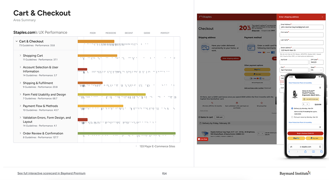
Review of Baymard heuristic evaluation
We had recently hired Baymard to do a site-wide audit so we had some learnings from their heuristic evaluation.
Remote whiteboarding exercises
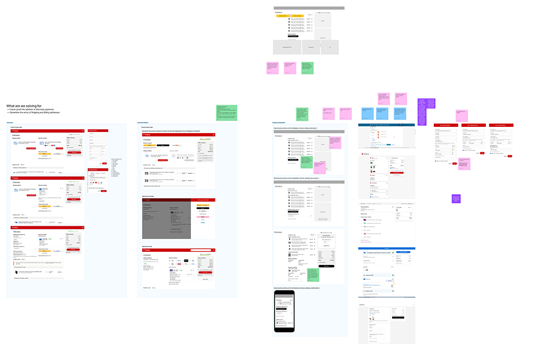
We are a distributed team so we used Figjam to collaborate.
- What should our process be?
- What are we solving for?
- How will we measure success?
- Collaborative sketching & wireframing
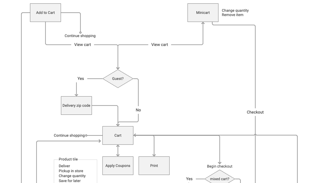
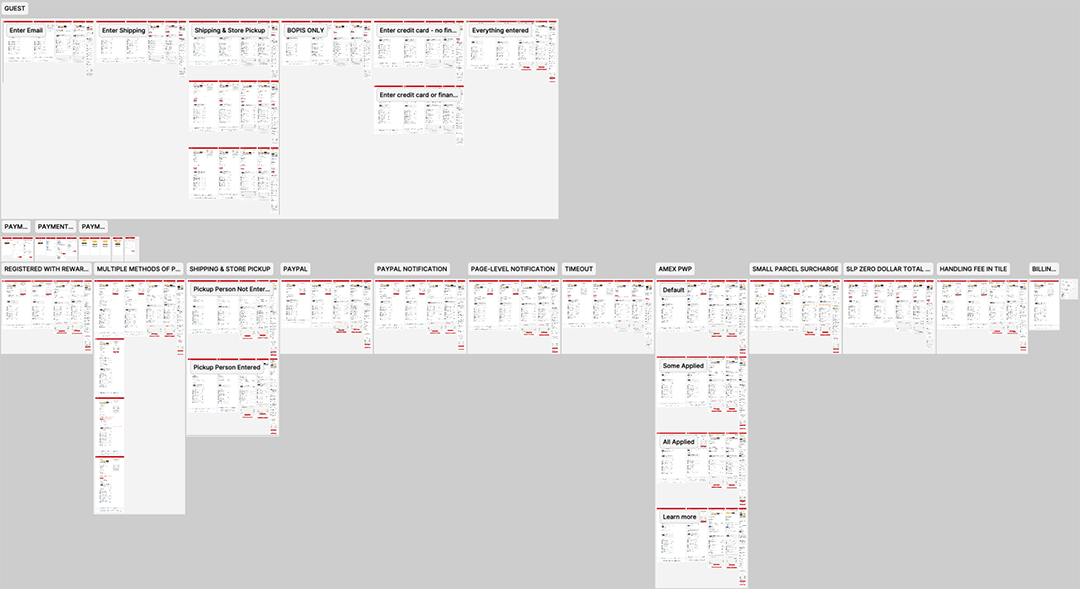
System diagram
I took some time to document functionality at each stage of the process. The developers really appreciated this and it provided the team with a reference for the scope of the project.
Wireframing and Prototyping
I built a fully functional prototype in Axure so we had a shared vision of how things should work. We also used iterations of this for usability testing as we worked through the design phase.
Usability testing
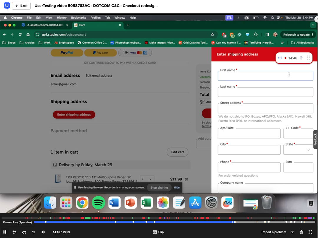
During the design phase I conducted 12 remote unmoderated studies comprising 88 participants done through usertesting.com. Some of the things we tested were:
- Ease of use of the new design in pure Guest state, including adding Email, Shipping, and Credit Card
- Ease of use of editing Email, Shipping, and Credit Card
- Ease of use of selecting and editing PayPal
Visual design
I completed 150+ comps in Figma comprising every use case.
Results
The redesign is in the process of ramping so I do not have hard numbers at this time.
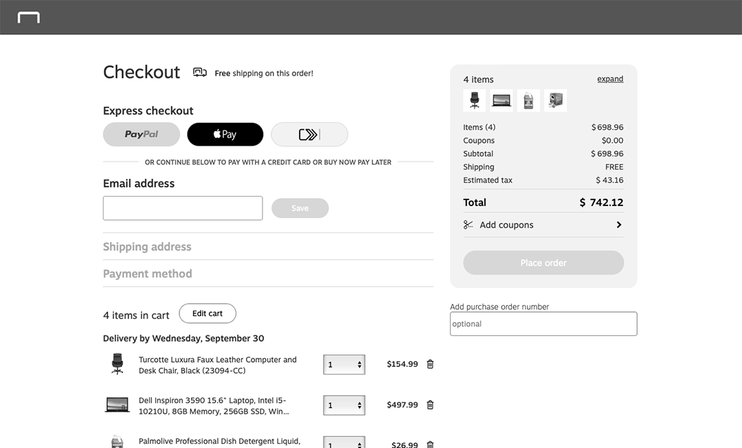
Before – Guest state
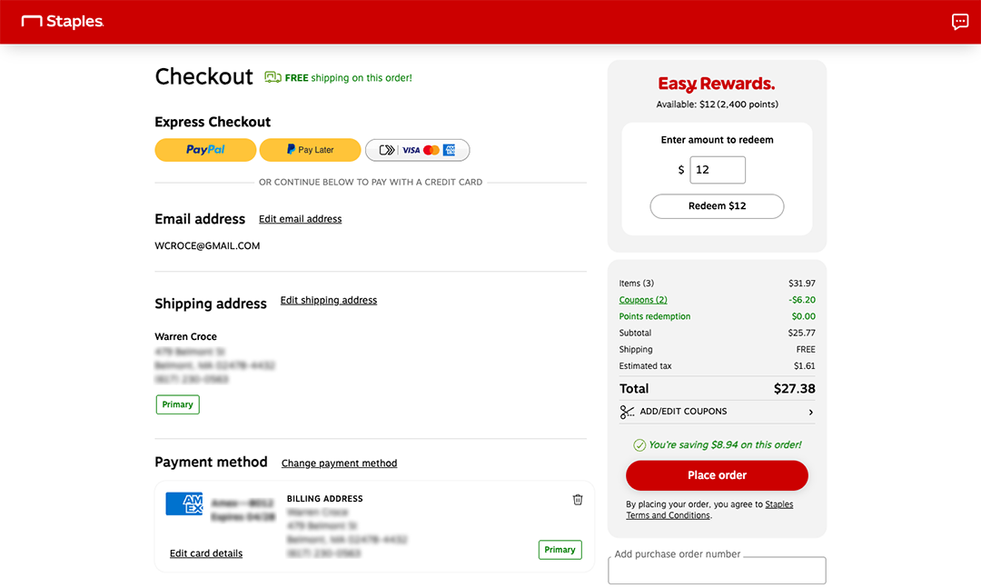
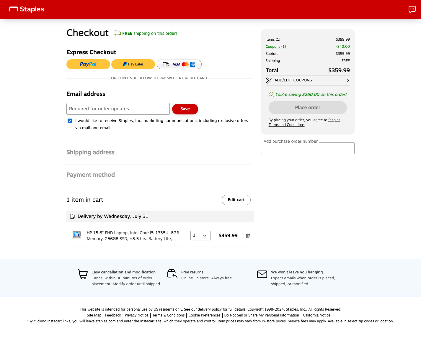
After – Guest state
Takeaways
Sometimes there is so much work that I can get into a “let’s get it done” mindset and since this is eCommerce we do need to move quickly. However, there are times when taking a step back to reassess is absolutely the right thing to do and sometimes it takes courage to “slow the train down” so to speak, and make a case for a redesign.

