Hooked on Phonics
Context
The Hooked on Phonics iPad app is quite successful and popular with over 1,000 downloads/day.
However, only 2% of users who download the free version convert to the full paid version.
The work was focused on improving three areas:
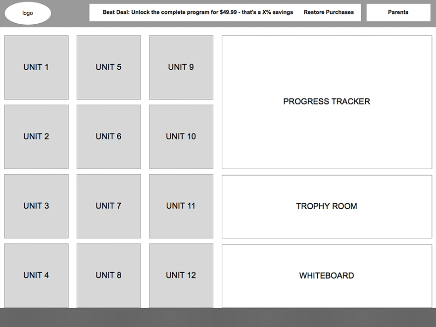
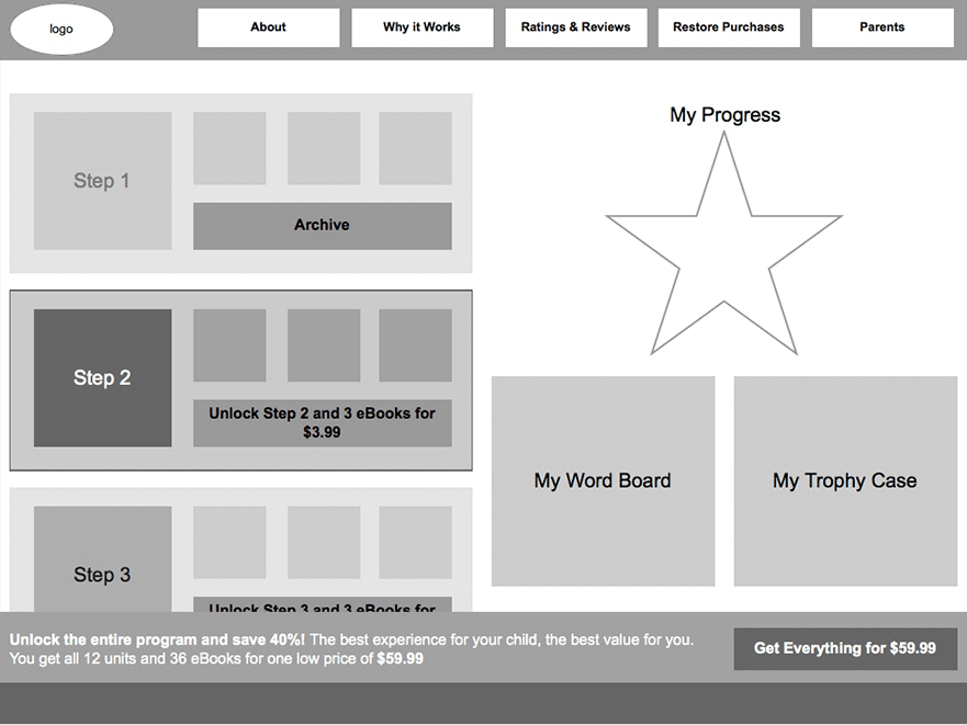
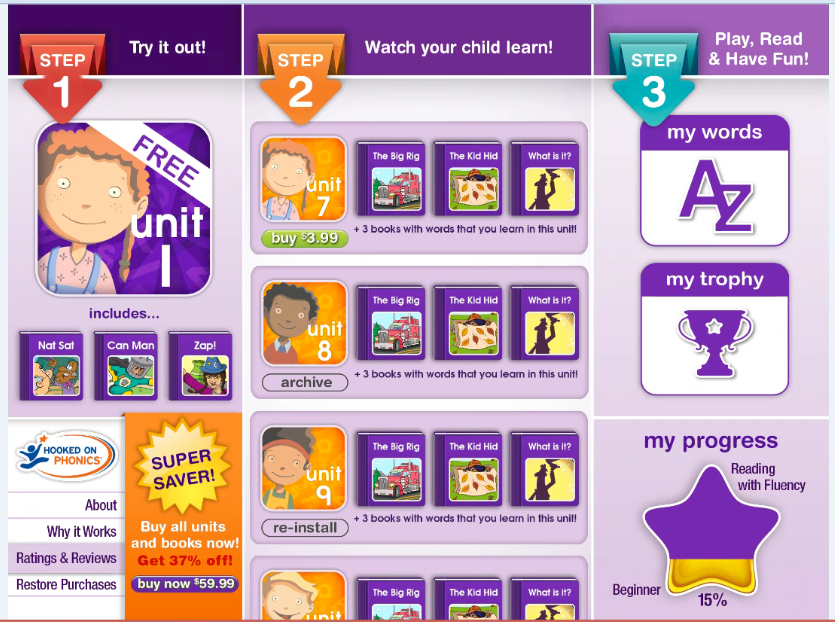
- A portal to the trophy room
- A portal to the white board free play area
- A progress tracker that shows the user their percent complete with the entire program in an
infographic.
Activities
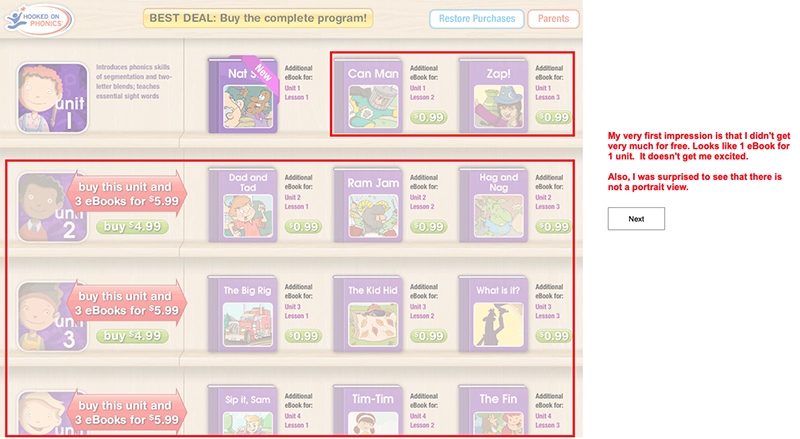
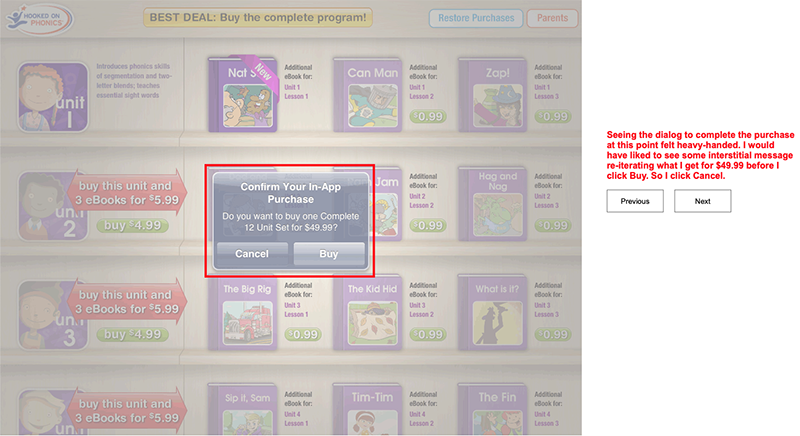
Heuristic evaluation
The first phase in the process of increasing conversion was to evaluate the current app for opportunities for improvement. In that evaluation I also included a draft of a possible design revision to the home screen to address some of the issues.
See the evaluation here
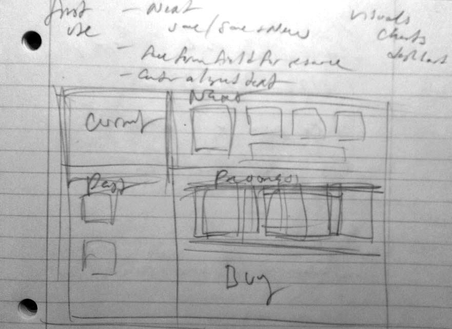
Sketching and Prototyping
I worked on a fast timeline and the sketching and prototyping phase was just a couple of weeks, which also included usability testing. I was a contractor for this job so I met virtually twice a week with the President of Consumer Direct Marketing and we would have working sessions and iterate in real time.
Usability testing
The main finding from usability was the more guidance and “hand-holding” we could provide to the customer as to what they get with each progressive step, the better. This had to be crystal clear and the user had to be made to feel like they were not being shamelessly upsold, but indeed that the value proposition with each step was presented in such a way that the user was comfortable.
Visual design
The visual design phase was pretty straightforward as Hooked on Phonics provided all the assets and it was a matter of re-working them in the revised layouts.
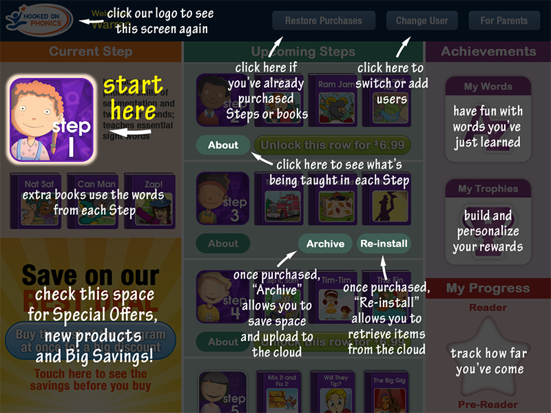
One new aspect that was introduced as a result of usability was the “chalk talk” you see in the second screen.
Results
As a contractor I was not privy to the actual numbers butI was told that in the two months following launch, users who downloaded the free version and converted to the full paid version grew “significantly.”
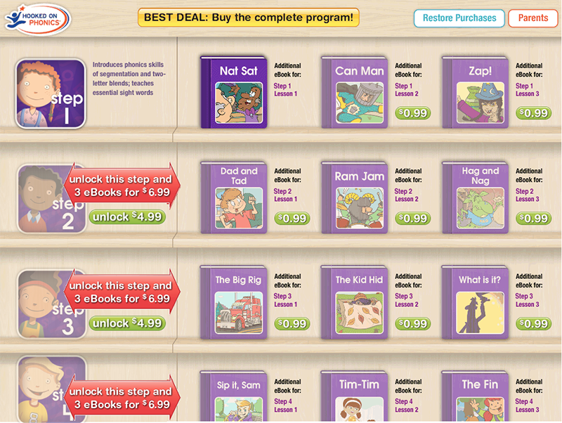
Before
After
Takeaways
This project team was too small for how I like to work – with just me and the President of Consumer Direct Marketing, who was the de facto Product Manager. I always like to have a developer or two on the project but they were not made available to me. Regardless, we met our objective of increasing conversions to paid, and I got to work on a whole new domain for kids’ apps which was very fun.

