Staples.com Easy Rewards
Context
Staples decided to completely change its Rewards program with the goals of:
- Increased customer retention
- Increased share of cart
- Increased revenue per customer transaction
Activities
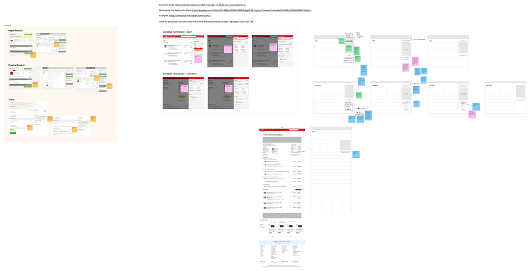
Remote whiteboarding exercises
We are a distributed team so we used Figjam to collaborate.
- What should our process be?
- What are we solving for?
- How will we measure success?
- Collaborative sketching & wireframing
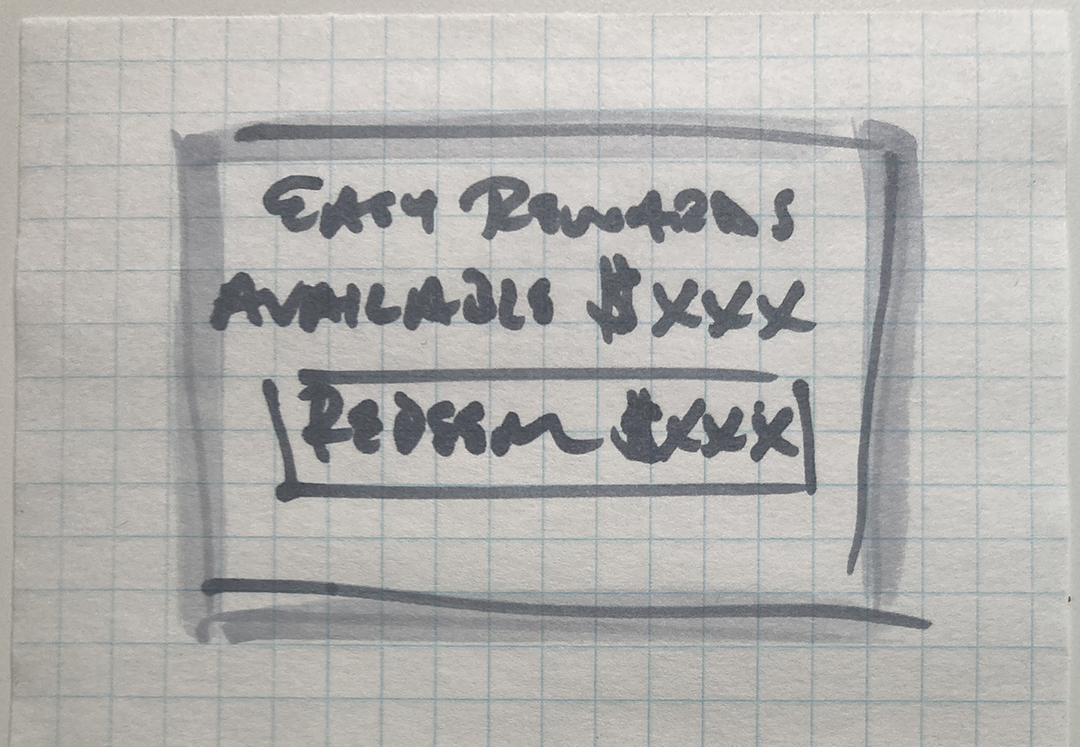
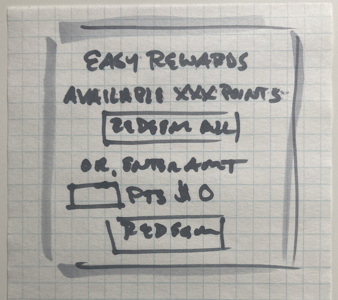
Sketching
We had recently hired Baymard to do a site-wide audit so we had some learnings from their heuristic evaluation.
Wireframing and Prototyping
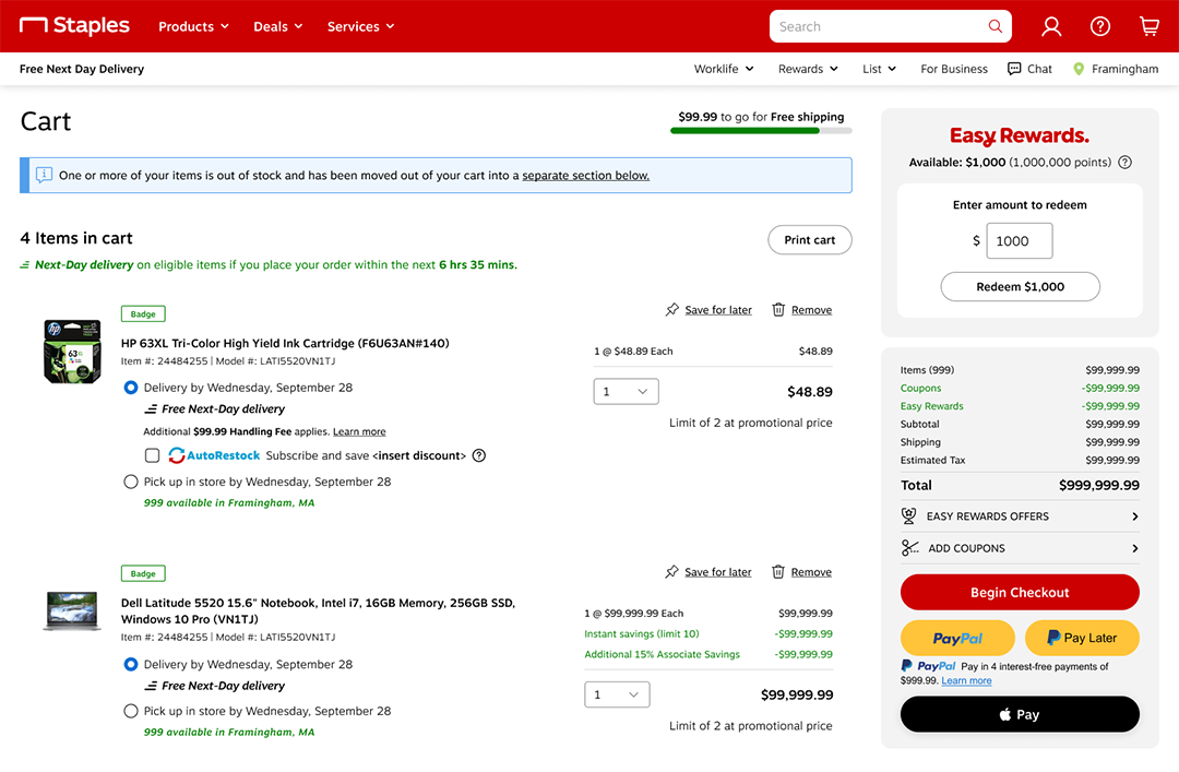
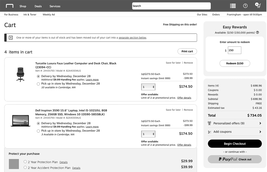
I built a fully functional prototype in Axure so we had a shared vision of how things should work. We also used iterations of this for usability testing as we worked through the design phase.
Usability testing
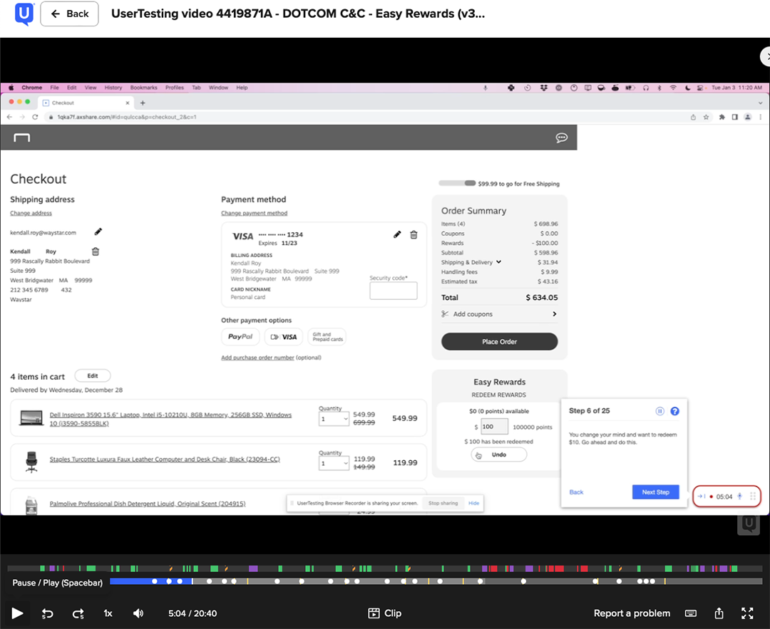
During the design phase I conducted 12 remote unmoderated studies comprising 88 participants done through usertesting.com. Some of the things we tested were:
- Ease of use of the new design in pure Guest state, including adding Email, Shipping, and Credit Card
- Ease of use of editing Email, Shipping, and Credit Card
- Ease of use of selecting and editing PayPal
Visual design
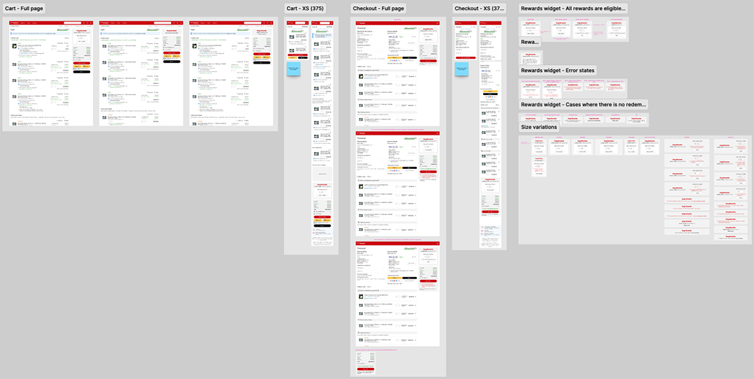
I completed 150+ comps in Figma comprising every use case.
Results
I am not at liberty to disclose specific numbers so I cannot speak to the results at that level. I can say that it has been a very successful program and has increased customer retention and satisfaction.
Takeaways
It’s not often that a true site-wide initiative comes along that requires you make yourself visible at a different level. Being the lead on the design of the redemption widget at the bottom of the funnel came with a lot of expectation and pressure. By iterating, testing, and continually presenting those results out the wider group of stakeholders I was able to bring them along on the journey from the beginning.

