Gazelle – Mobile
Context
Gazelle had always been a device trade-in service. After about six years of focusing on that side of the business, we launched our first direct sales channel…in 90 days. As a result of the time-to-market, we opted to use a responsive design to at least provide a semblance of order on mobile.The first 9 months after launch was very much focused on the desktop experience. Within a year we had some breathing room to get back to mobile.
Activities
Research
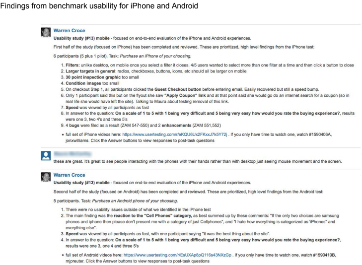
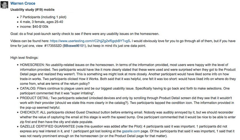
I ran a usability study to look at the end-to-end experience. There were many findings in regard to how we could improve various areas of the site. Specific to the homescreen, as a result of the responsive layout, we weren’t optimizing the available space and were not providing users with quick enough access to products.
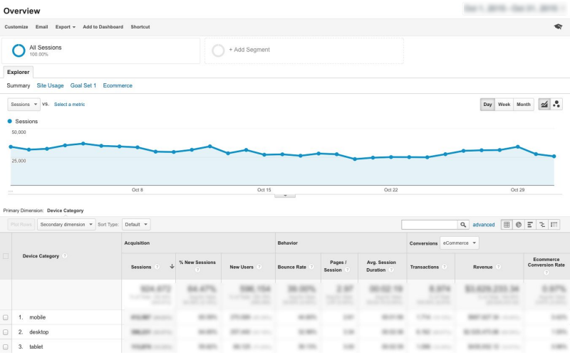
We also ran analytics across devices focusing on the bounce rate and we determined most of the bounce on mobile was happening on the home screen.
Define the goals
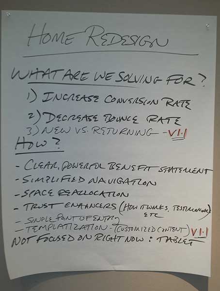
Are deciding to focus on the home screen, we sat down as a team to define what we were (and were not) solving for:
What are we solving for
1. Increased conversion rate
2. Decreased bounce rate
How
1. Clear, powerful benefit statement
2. Simplified navigation
3. Space reallocation
4. Trust enhancement (How it works, Testimonials, etc)
5. Single point of entry
6. Templatization (landing pages can be created simply by swapping content)
What we are not solving for
1. Tablet
2. New vs. Returning experience
2. Personalized content
Remote whiteboarding exercises
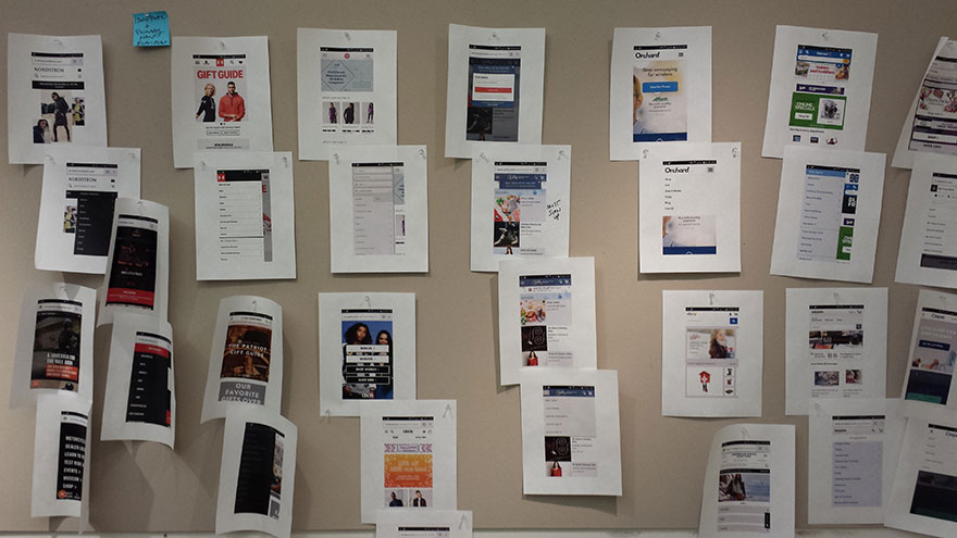
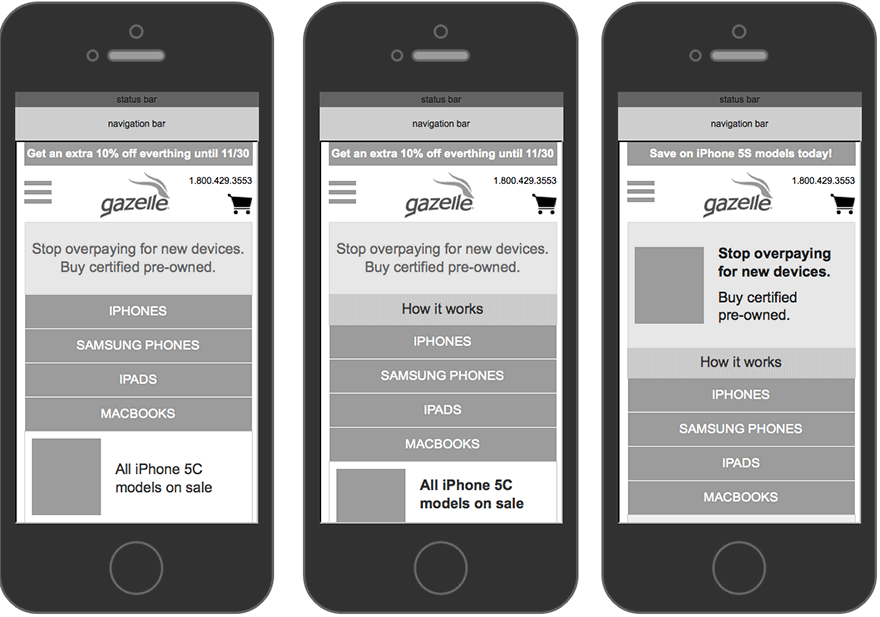
We continued our collaborative working sessions with Product and Engineering to inventory content and identify improvement areas. After that we gathered some examples of other popular brands’ mobile homescreens – simply to have out there as reference.
Sketching and Prototyping
Here is an early prototype (iPhone is active).
Usability testing
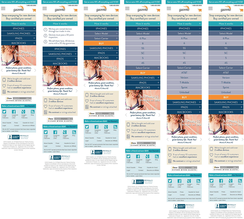
Our interaction design for digging down and progressively disclosing information worked well. However, we learned that we were not providing nearly enough context on where these devices were from and how they were vetted.
More Prototyping
Here is a second prototype (iPhone is active).
Visual design
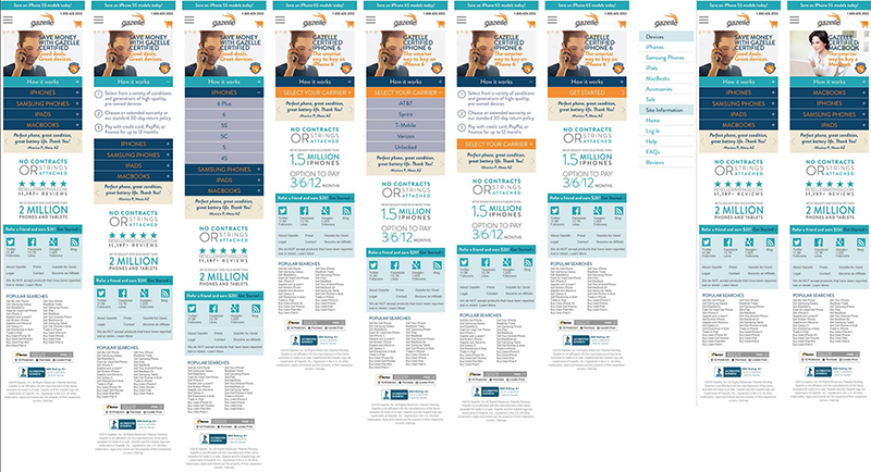
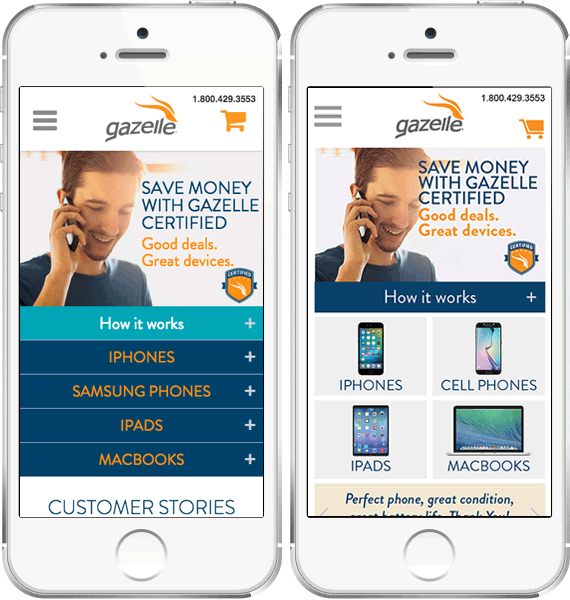
The first was what we released initially and in A/B testing was ahead of the control but only slightly. The second image shows a revision using device imagery instead of text.
Usability testing
The version we usability tested was the version on the left. It tested very well, especially in terms of the intended interaction design.
Results
It was a surprise that even after usability testing the revised layout (the image on the left above) conversion rate dropped in the first two months by 2%! The revised design (the image above with the device imagery instead of text) drove 300% more clicks to iPhones and increased revenue by roughly $600k YOY.
Takeaways
Usability is always directional, never gospel, and you may very well be surprised by what you find after launch! Be ready to revise quickly. Also, it’s amazing what you can do in a short amount of time with a small team and a shared vision!


